Rebranding the Coca-Cola Stores
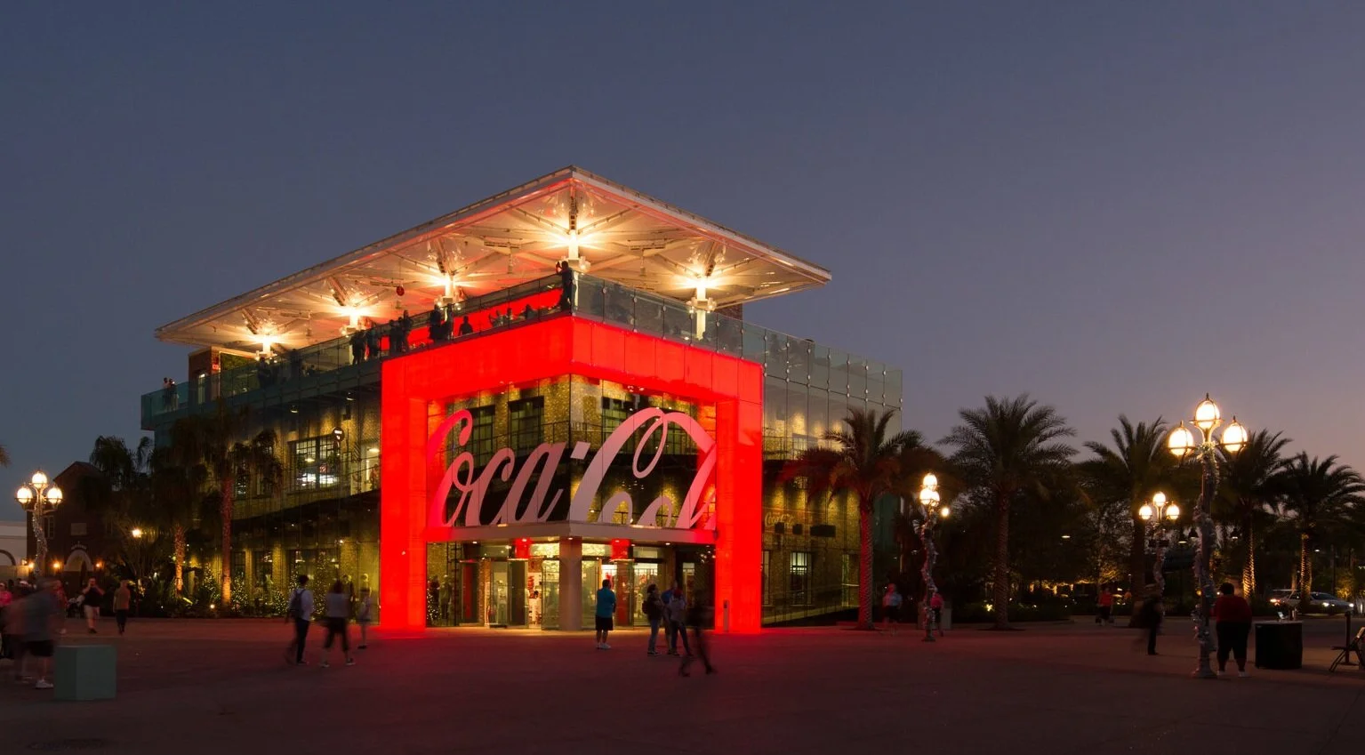
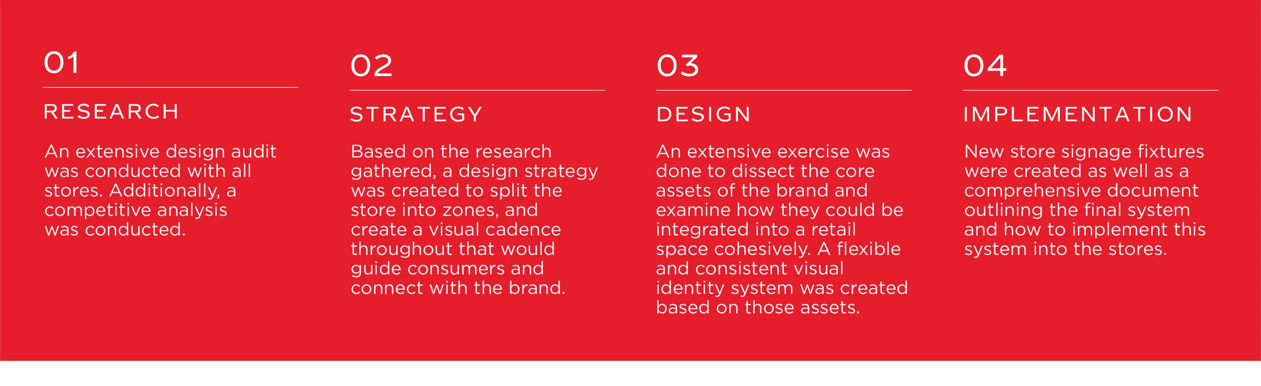
The Coca-Cola Company owns and operates four retail stores in Atlanta, Las Vegas and Disney Springs. The unique challenge for these stores was unifying the look and feel of them despite a lot of disjointed design throughout the years. This was a fresh approach to the stores which sought to take an iconic beverage brand, and make it relevant in the retail space. This process included many phases including: research, strategy, design and implementation.
Before
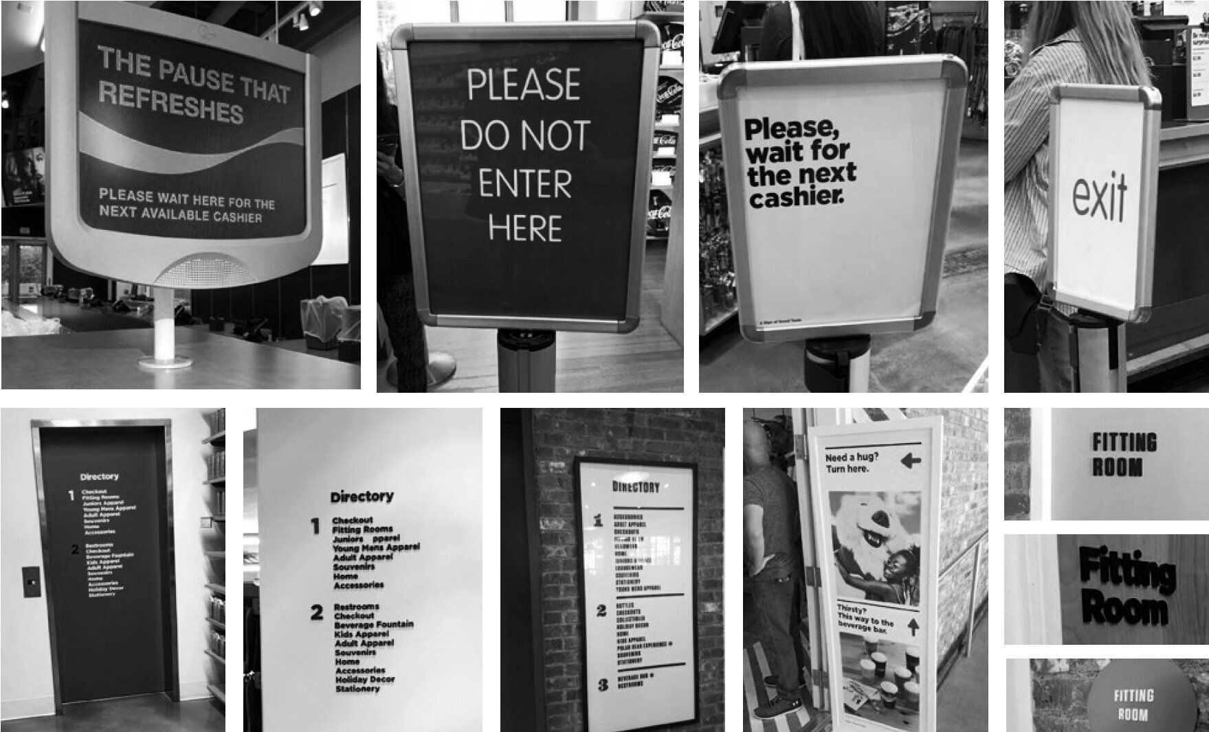
The Coca-Cola stores didn’t have a visual identity system that tied all of them together. It was a mix of typefaces, sign applications and wayfinding that didn’t sit as a cohesive set. Each store had its own sign fixtures that differed from location to location, and each had its own signage system.
Creating a visual identity system for
retail stores based on the equity of a decades-old brand.
During this process, it was important to distill the brand into its most core assets and also create a flexible and timeless system that could be implemented into a retail space.
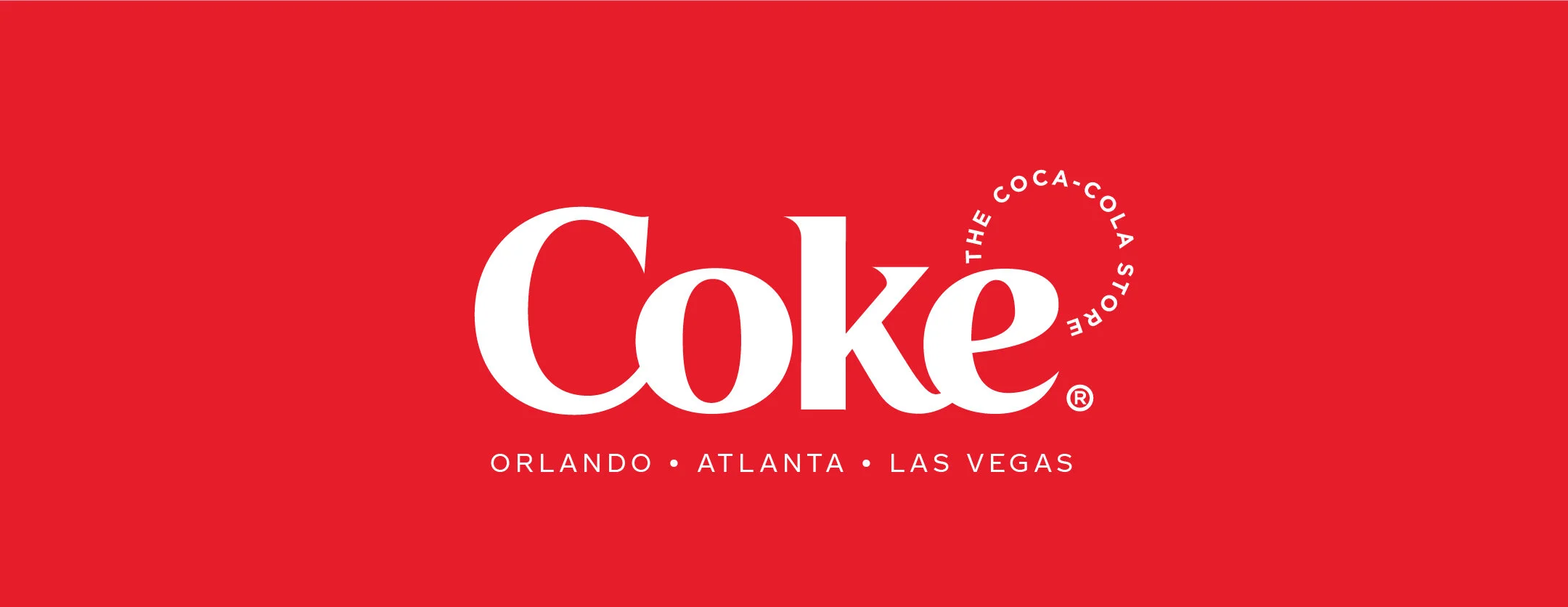
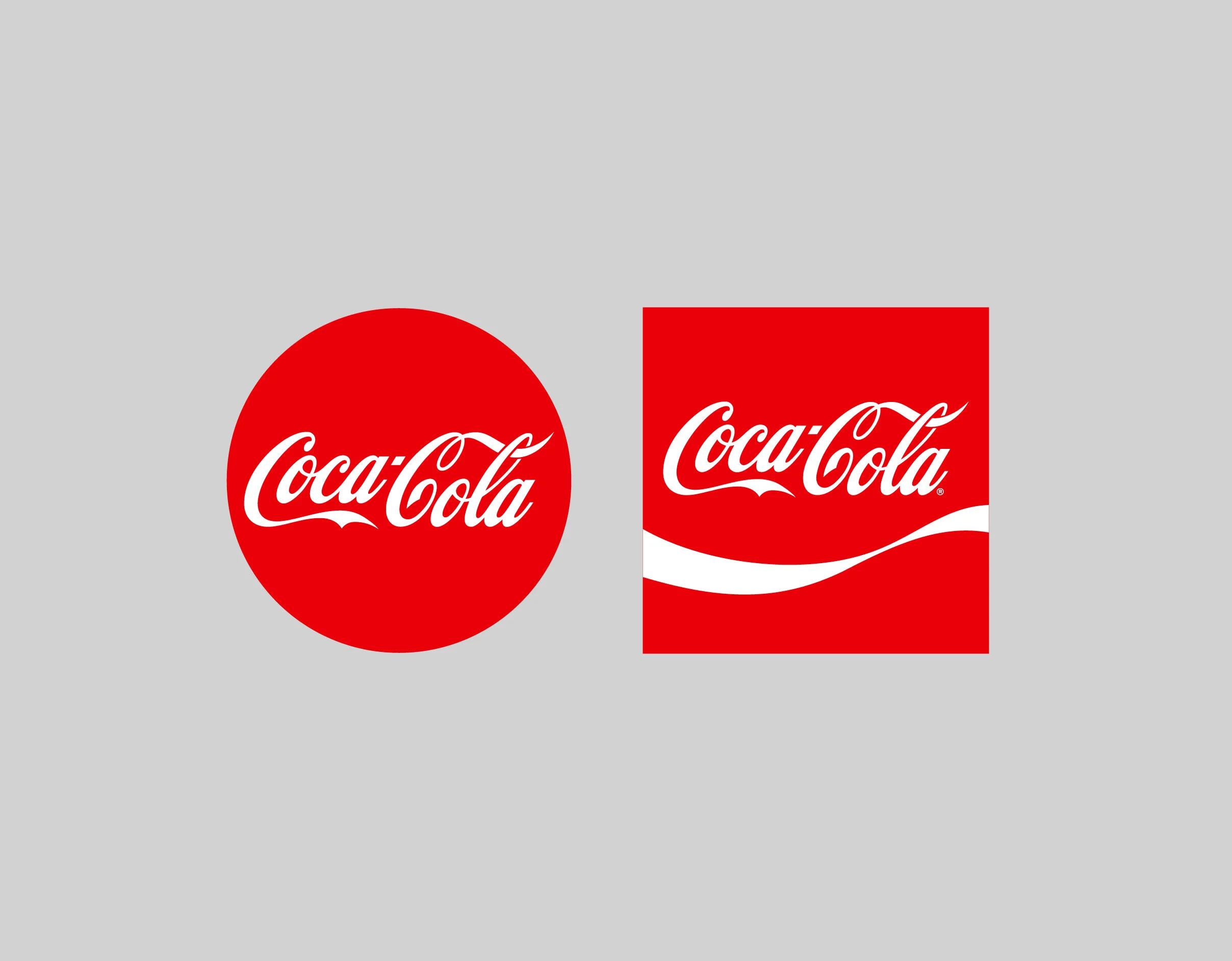
The two most core elements of the brand, are the Red Disc® and the Arden Square®. These elements represent the brand’s past present and future. The Red Disc® was the first Coca-Cola sign used in the 1950s to signal that the beverage was sold at convenience stores and gas stations. The Arden Square® was created in 1969 through one of the most iconic rebrands in the company’s history.
A Dynamic and Flexible Store Signage System
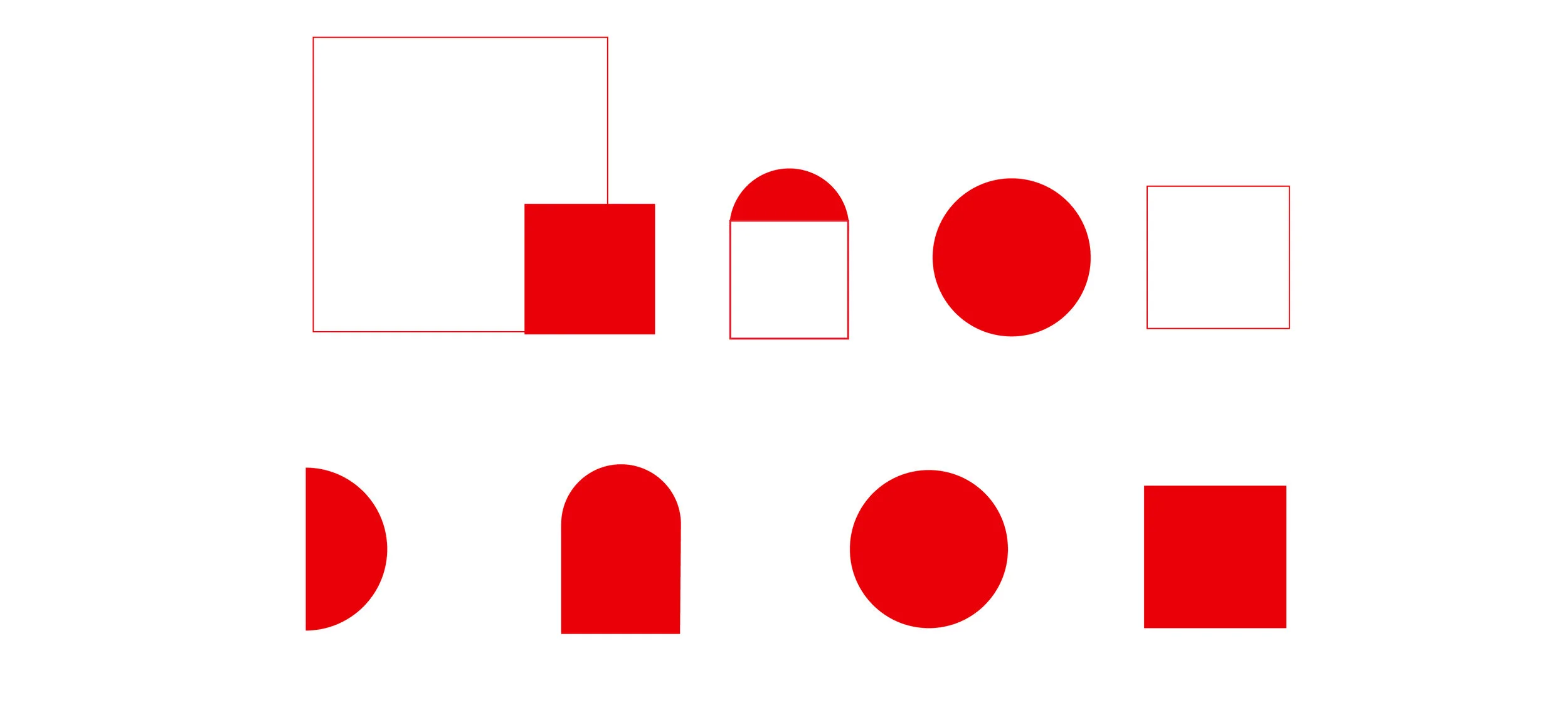
The existing store signage system was a hodgepodge of different signs, typefaces and graphic treatments. The first step in correcting this, was creating a system that uses the heritage of the brand: the Arden Square® and the Red Disc®. Stripped down to their barest forms they are a circle and a square. Each sign and fixture would follow this form guideline, leading to a cohesive systematic approach that points back to the brand’s heritage.
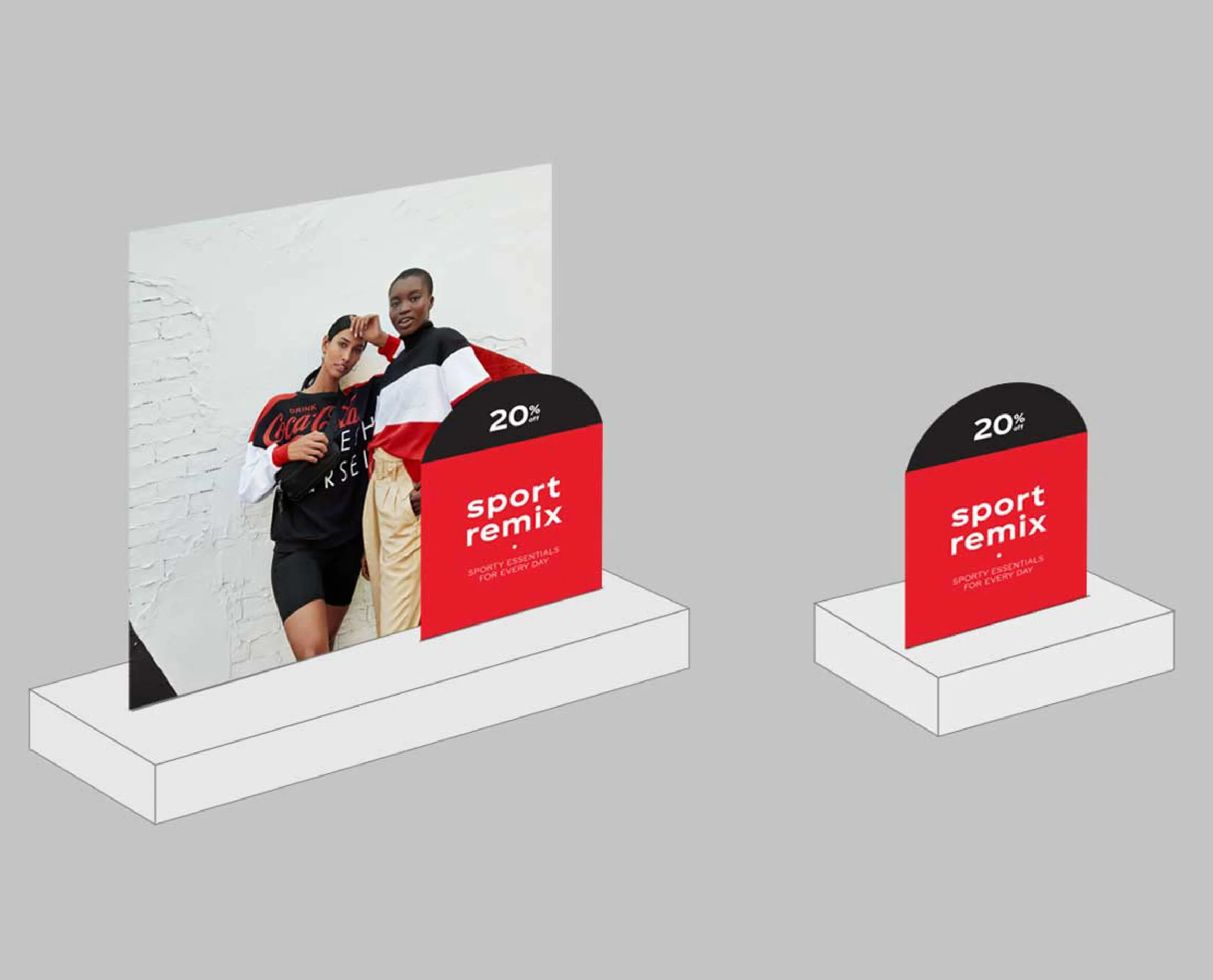
A New, Layered Signage System
The store fixtures prior to this project didn’t unify the core messages into one visual unit which often resulted in five or more signs scattered across a fixture. This was confusing for the consumer, and didn’t convey a cohesive message. With this new layered signage system, the eye is drawn to one area which communicates all the necessary information at once. The signage can be added and removed as needed to convey sales or promotions.
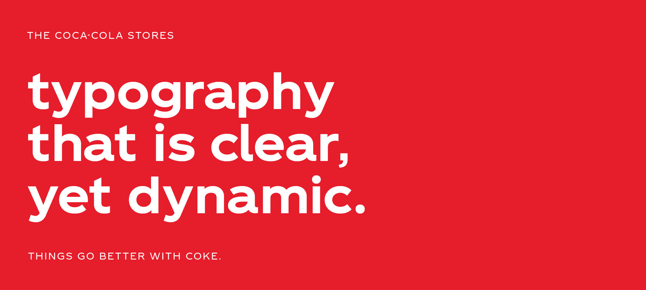
A Bold New VIS that is Flexible and Dynamic
Taking the core aspects of the circle and the square, a dynamic and flexible VIS was created that points back to the brand’s heritage, while injecting a sense of fun and playfulness. The system is clear, bold and enticing.